Meanwhile it's time to link up for Photo Art Friday. This weeks optional theme was:
Minimalist. - Yikes! I had no clue about how to go about this weeks theme. I look up minimalist art and photography and saw some interesting things but still didn't know what I was going to create.
I came up with something before I looked the theme up so I'm showing it first.
Original Photo: Click to enlarge all photos.
Edit #1 - I used a couple of Bonnie's textures on this piece but forgot to write them down.
Edit #2 -
I kept the same textures in the photo but used something on BeFunky.com (Stenciler) feature and this is what I got. I love this for some reason.
Okay next up is my other piece:
Original Photo:
Edit:
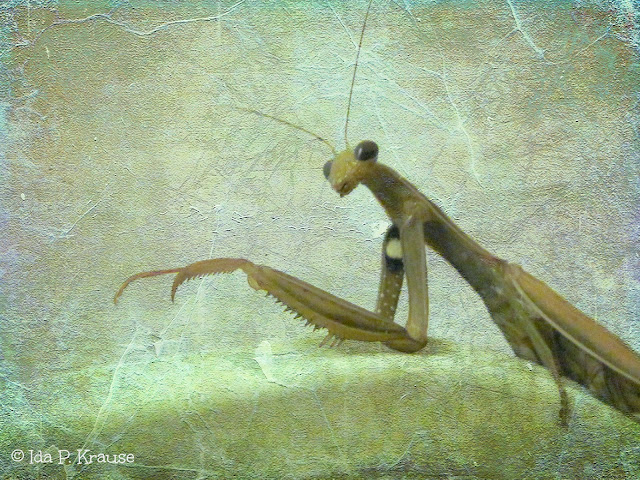
Finally:
Original:
Edit:
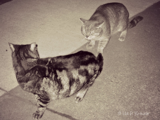
Cropped, Edited to Black and White and made to look like a vintage photo.
So which do you think is the most Minimalist?
Be sure to stop by Bonnie's blog, Pixel Dust Photo art and check out all the great art work there. Have a great weekend.


what fabulous examples of minimalist you have here~!~
ReplyDeletei love both of the buttons pieces and that mantid is breathtaking~!!~
:-)
libbyQ
great pieces - I love the black and white buttons and the textured insect is beautiful
ReplyDeleteI totally love that long, thin creature. You edit is splendíd. :)
ReplyDeleteGreat series of photos!! Love the praying mantis...minimal and striking!
ReplyDeleteHugs
SueAnn
Nice buttons and the green picture, so nice (I do not know what it is).
ReplyDeleteWow - that fifth (I think) image with the bluish texture is one gorgeous piece of photo art. Love your treatments of the buttons too.
ReplyDeleteI love them all - but the cats the most - great shots.
ReplyDeleteall are wonderful! like the buttons - something so simple shown in such an interesting way :)
ReplyDeleteI like edit #1 but the praying mantis, with the edit is my favorite!
ReplyDeleteI love your edits! Be Funky is such a fun website! I'm not sure which one is most minimalist, I can't decide!
ReplyDeleteThey're all good.
ReplyDeleteBut, my pick is the praying mantis.
Very nice.
oh these are spectaculicious, Ida!! such a fun exploration of the concept. I love the cricket, is it?! the colours are sensational in your edit. mmmmmmm...
ReplyDeleteI love that you go exploring in similar places that I DO. you have inspired me to get into them and learn which, frankly, I don't have near as much fun DOing in PSE8.
really fun stuff!!
Love what you did with the buttons, Ida. Very creative! There is a wide variety of textures but still translates as minimalist to me.
ReplyDeleteHi, I think you definitely got the idea behind a minimalist photo....you got a bunch of them. I am partial to the buttons...I like the way you lined them up and the texture you used. I was looking at your past post of the frost....you love your macro shots...and they are wonderful. The frost on the red petals shows off magnificently. You do great work. smiles: sharon
ReplyDeleteImpressive ... I like these beautiful photos, especially the photo of the praying mantis, sensational!
ReplyDeleteLove the different feeling that each of the three images have. Especially like the Praying Mantis....outstanding capture!
ReplyDeletelove the black and white version of the buttons!
ReplyDeleteLove the insect photo. The moggies are interesting too.
ReplyDeleteThanks for sharing.
great work, Ida. I especially like the praying mantas - how on earth did you get it to stay still long enough for a photo?!
ReplyDeleteThe Praying Mantes wins for the minimalist challenge but I just love, love, love the buttons!
ReplyDeleteThe Praying Mantes wins for the minimalist challenge but I just love, love, love the buttons!
ReplyDeleteThe Praying Mantes wins for the Minimalist Challenge, very nice. But, I just really love the buttons!
ReplyDeleteThey're all wonderful, but that praying mantis is brilliant! I love it...
ReplyDeleteThey are all wonderful, but that praying mantis is brilliant! I love it...
ReplyDeleteMy favorite it the second button picture; although, the praying mantis edit is really cool too! :)
ReplyDeletewow - your photos from Photo Art Friday is awesome - I did not think of ever using buttons -- I am more into landscaping but you got me thinking of trying something like this... thanks for sharing..
ReplyDeleteHugs
ReplyDeleteWow, you photo art edits are amazing!
Thank you for dropping by pret-a-vivre.com
Hi! Wonderful photo art! I love the kitties..
ReplyDeleteThat insect picture is amAzing! Both versions. As far as which would be the most minimalist of your photos...hmmm...I'm leaning towards the smooth insect (is it a Praying Mantis??) because it has such lovely clean lines. I really like what you did with the button photo. My favourite is the brown-textured one; it seems so vintage. But I also like the starkly graphic feel of the desaturated version. Good stuff!
ReplyDeleteFor me the buttons work as minimal, particularly the stencil piece. Being drained of colour leaving only the interesting marks I think constitutes 'minimal'!
ReplyDeleteHave a lovely week.
Very nice processing! I love your stenciled buttons the best - very nice effect. And those two kitties don't look like they enjoy each other's company very much...lol. :)
ReplyDeleteThe grasshopper is great! Bravo!
ReplyDeleteThe 2nd edit of the buttons in brown is also a nice pic.
Your photo are very minimaliskt. Ha de gott.
ReplyDeleteYour praying mantis is outstanding, Ida! Nicely done!
ReplyDeleteI really like all these images - great editing! My favourites are the buttons an the grasshopper - but I do love the pussy cats too:)
ReplyDeleteThese are all great, Ida! I think my favourite is the BeFunky edited version of the buttons. Love that effect.
ReplyDelete