Happy Friday! - It's been a good week. The ice/snow has finally melted and things are back to normal around here. Well almost...You see the challenge this week for Photo Art Friday (PAF) was to create a piece of Abstract Art using 3 photo's or cropped portions of 3 photo's and at least 1 of Bonnie's textures. I was "scared to death" of this challenge. I mean how on earth could I take 3 cropped photo's and create Abstract Art with such limited knowledge of Photo Editing.
 I know it's a pretty odd combo of pictures but I like how this turned out. Again I want to add that I "tried" to write down the steps that I used to get my final effect but after several different changes along the way things sort of got muddled up as far as what I did so I'm giving you the best explanation that I can but it may not be totally exactly what I did.
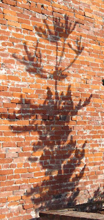
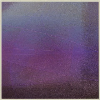
  I started by taking the Cropped Frog photo and adding the Brick Building/Tree Shadow Photo over it. First I re-scaled the shadow photo so that it was the same size as the Frog. Then I used Bonnie's texture: Heavenly in Difference Mode at 45.5% Next I took the Cropped Portion of the Berries which had already been Posterized and added them using Soft Light at 69.3% I added another layer of the Heavenly texture with the Hue adjusted using Soft Light at 20.8%
Here is what I came up with:
So how does all this fit into the title of my post? Well you see after I finished this version I started playing around with it doing different things on Picnik (which sadly is closing) and came up with some other versions.
This one is the same photo but I used the "Boost" feature on Picnik:
Pretty bright and certainly, Abstract.
Still playing around I Inverted the 1st Photo on Picnik and got this version:
So then my mom came over and I was showing her what I had done and decided to show her how I came up with my piece of Abstract Photo Art. I messed around with the 1st photo this time using Gimp and some Color/Hue changes and created this last version, which is my favorite of all of them.
I didn't write down the formula for this one though so I have no idea how I got the final version.
At this point I looked at the clock, it was 4:30 and it was time to start fixing dinner. I went to the Refrigerator and discovered the Roast that I had bought and was going to fix for dinner. Well needless to say at that late hour it was too late to start cooking a roast and still eat by 6:00 pm so we opted for Take-Out from KFC and the Roast waited until the next day.
I need to make a note when playing around to make sure dinner gets cooked on time!
Be sure to check out all the other Fabulous pieces of Photo Art on Bonnie's Blog.

.jpg)


I like the blue/green asbstract frog the best. I've been guilty of the same when loosing track of time while playing on my computer. :)
ReplyDeleteLove the "heavenly" texture - you came up with several excellent examples of choice. Very nice abstract and definitely a lovely focal point with the frog. How fun. Thanks, Karen
ReplyDeleteIt is a great abstract, well done. I keep a note book and print out a small image and paste to the page so I can go back and see what I have done. Cheers
ReplyDeleteWow, i didn't understand most of this but love the pics!
ReplyDeleteGood for you Ida - LOVE all your different abstracts! Wow! So Picnik is closing? Sad...
ReplyDeleteI think this turned out really cool and that you picked great photos to combine. Love that prominent frog!
ReplyDeleteWell done, Ida. It likely wasn't easy to choose your photos, but you did very well. :)
ReplyDeleteThanks for showing all the versions of your art - I agree, the last one is so intriguing. I love the vivid colors but they're not garish. I love the abstractness of it, yet there's a hint of the underlying shapes if you look hard. I love the complementary color scheme and how effective it is.....great creation! Thanks for the visit and kind comment.
ReplyDeleteBeautiful all, I love them all, with the brick wall reminds me of graffiti art. Excellent colors and textures. Greetings.
ReplyDeleteYou really do some cool things in post processing!
ReplyDeleteI really like the very last one the best. The colors work and maybe I like the affect of the brick work showing here..
ReplyDeleteI like the final version.
ReplyDeleteIt's interesting and lovely.
Regards and best wishes
wonderful metamorphosis :)
ReplyDeleteYour abstracts turned out well - I especially like the stripes texture showing through on the last photo. Remember - "success is in the effort"!
ReplyDeleteI'm smiling that you overcame your fear of creating photo art so much that you got a late start on dinner! :) I love your effects! They're beautiful...I think the reason I love creating photo art so much is that there are no rules and I can just let go and enjoy myself. Thank you for sharing your images!
ReplyDeleteWhat fun ...and what a pleasant result!
ReplyDeleteWhat fun..and the results are grand...
ReplyDeleteI really like how your final turned out. Very colorful and abstract.
ReplyDeletesuch a variety of effects you achieved Ida with the three photo combo; a trilogy!
ReplyDeleteMy hats off to you, playing around with all that stuff must get confusing. The all look great and very abstract!
ReplyDelete